BRAND DESIGN
The West Coast
Pie Company
Their Story
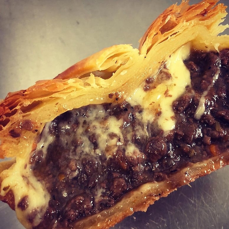
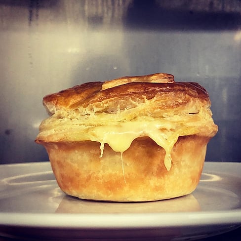
The story of the The West Coast Pie Company begins with Emily Lucas, who, as the founder and pie expert, transitioned from managing a restaurant to becoming a chef. Concerned about the sustainability of the food industry in New Zealand, Emily sought out alternatives and discovered Premium Game, a company offering wild meat. She introduced wild meat to her restaurant, which was well-received. Inspired by a food writer's praise for their pies, Emily saw an opportunity to popularise wild meat through pies, leading to the creation of her signature venison steak pie and eventually The West Coast Pie Company. We were involved from conception to print of the brand of The West Coast Pie Company. The company, launched in 2020, quickly gained a loyal following for its commitment to promoting wild meat's superior flavour and environmental benefits. Within two years, the business expanded to open a brick-and-mortar bakery in Westport, experiencing great success. Emily's journey highlights how a small idea fueled by passion can transform an industry and promote sustainability. Through her company, Emily challenges perceptions about wild meat, contributing to a more sustainable future for New Zealand's food industry.
Design
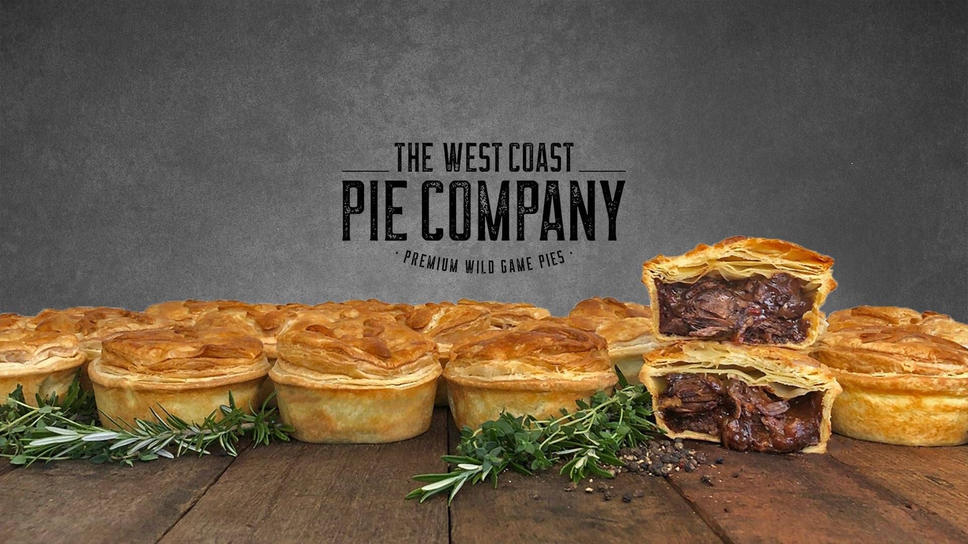
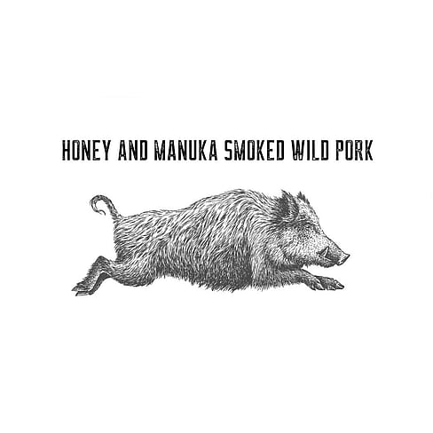
Emily had a very clear vision of what she wanted for The West Coast Pie Company. As the designers behind The West Coast Pie Company Brand, we approached the branding process with a deliberate strategy based on client requirements. Emily commissioned an illustration of a deer as a start and we rolled with that. We opted for a black and white colour palette, paired with a hand-drawn raw sketch style to evoke the rugged essence of wild meat. To further accentuate this theme, we selected a raw, yet robust font to serve as the corporate typeface.
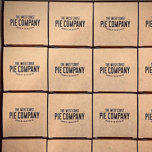
The result is a striking yet minimalist brand identity that resonates with the untamed nature of the product. This aesthetic is carried through to the packaging, which is crafted from Kraft carton material, lending an authentic and earthy feel to the pies.
In essence, our design choices aim to capture the essence of The West Coast Pie Company – bold, natural, and unapologetically wild.
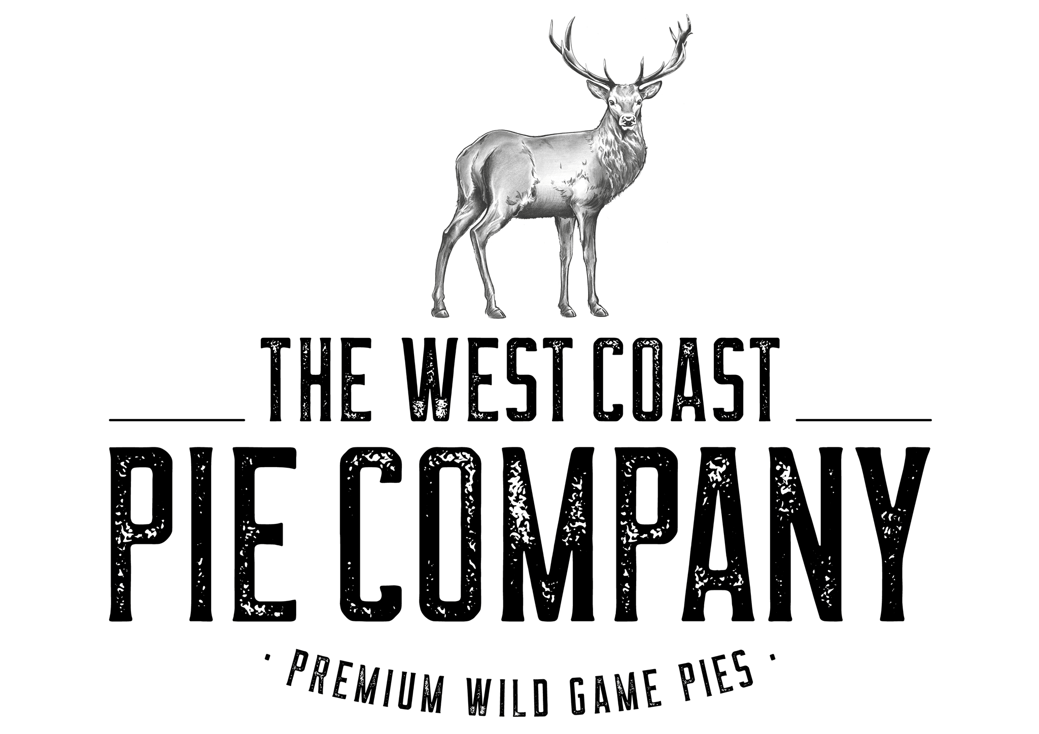
The Logo
The logo design for The West Coast Pie Company Brand incorporates a black and white colour palette and a hand-drawn raw sketch style to reflect the essence of wild meat pies. The choice of a bold, edgy font adds strength to the design, is memorable, versatile and evokes a strong emotional connection to the product.
BOLD. NATURAL. UNAPOLOGETICALLY WILD.
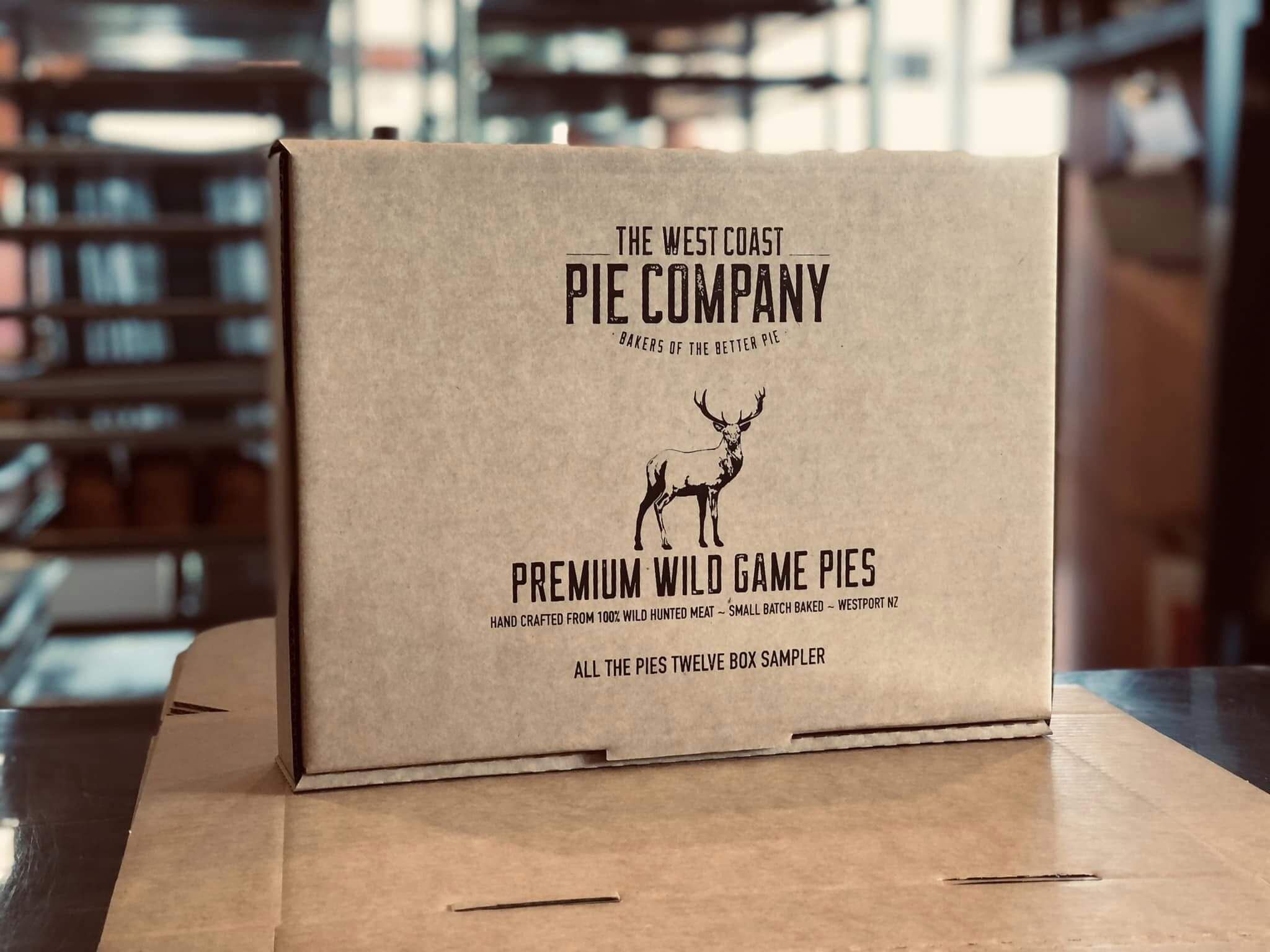
Packaging
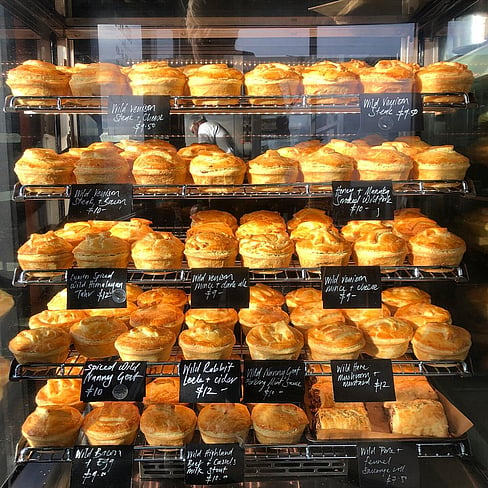
This packaging is highly effective for pies due to its sturdy Kraft carton material, visually appealing design with a black and white colour palette and hand-drawn raw sketch style, consistent reflection of the brand's identity and values, practicality in providing ample space for information, and differentiation from competitors. Overall, it enhances the product's presentation, protection and consumer experience.
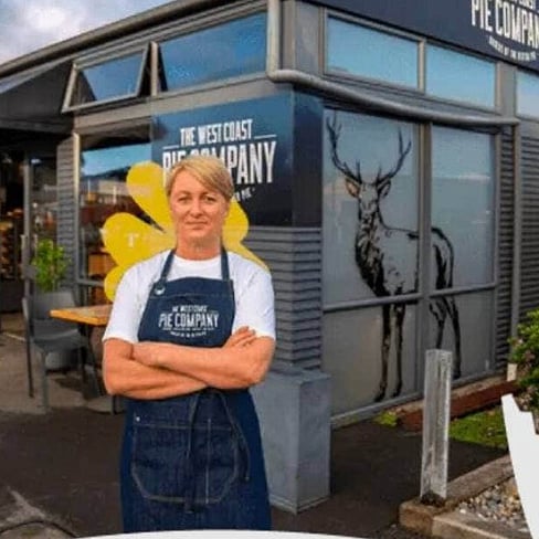
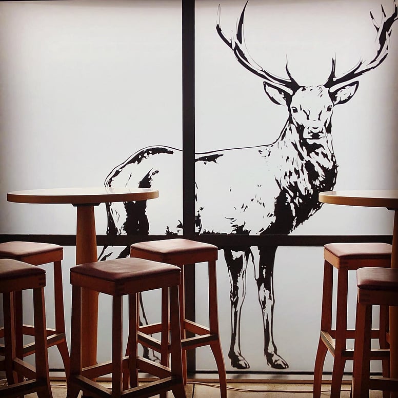
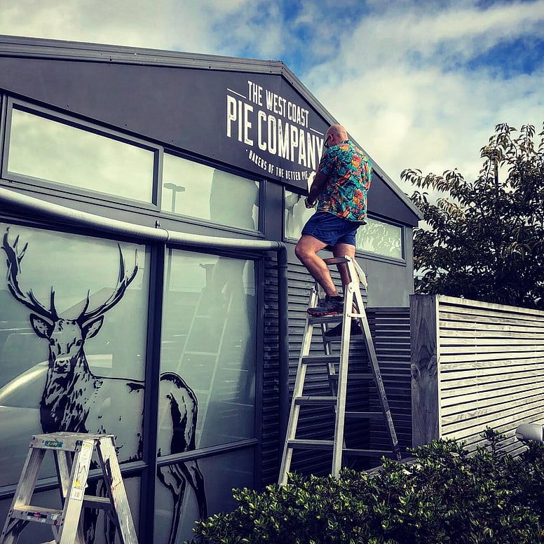
Signage and Print
For the signage, shop fit out and printed menus, we incorporated a line-drawn deer motif onto frosted windows, seamlessly extending this design theme onto the menu boards.

Ready to work with us?
Let's talk about what you need! We can help you with all of your graphic design requirements - whether it's a logo, a full branding package, designing your annual report or a print job.
Drop us a line - we'll book a time to meet so we can go over your exact requirements and then provide you with a free quote and a timeline.
CONTACT US
+64 7 392 1122
+64 27 296 0727
design@sonsofserif.com
Level 1, Suite 2,
202 The Strand, Whakatāne